
The Pressure to Conform - Even in Art
One would think that in art especially, originality would be valued. But this is not necessarily true.
Many of the pattern designers that I meet on the Web are trying to make a living with their art. I understand it. They want to be their own boss, doing what they love. And while it has the potential to be rewarding - although no one is going to get rich at it - it’s a hard slog. Not only is there making commercially viable art, but there is also continually adding designs to POD (print on demand) shops, marketing on various social media platforms, and contacting companies in hopes of getting a licensing deal - each of which is a full time job in and of itself.
I wish everyone who embarks on this journey the best of luck.
But anytime commercial interests come into play, the value of originality decreases. Here are the winners of the last twelve Spoonflower challenges (wallpaper, fabric, and home decor are all represented):
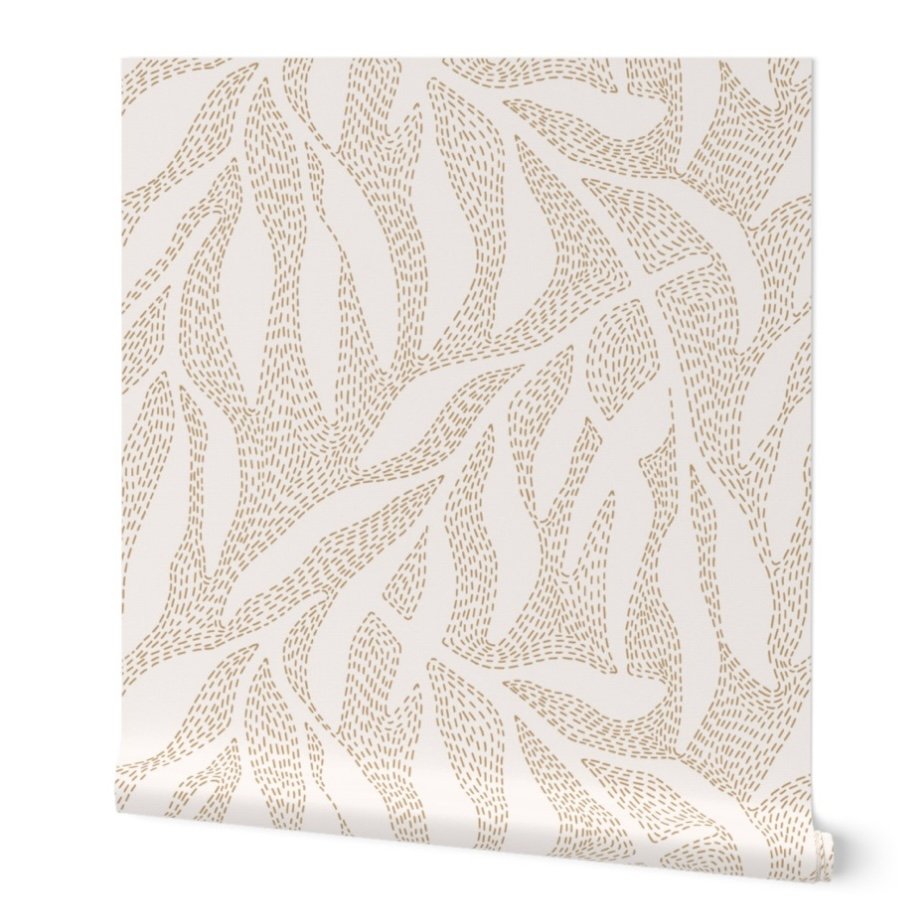
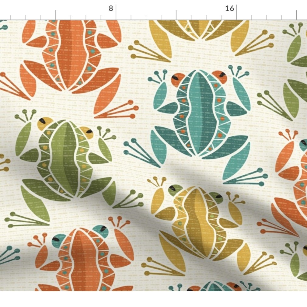
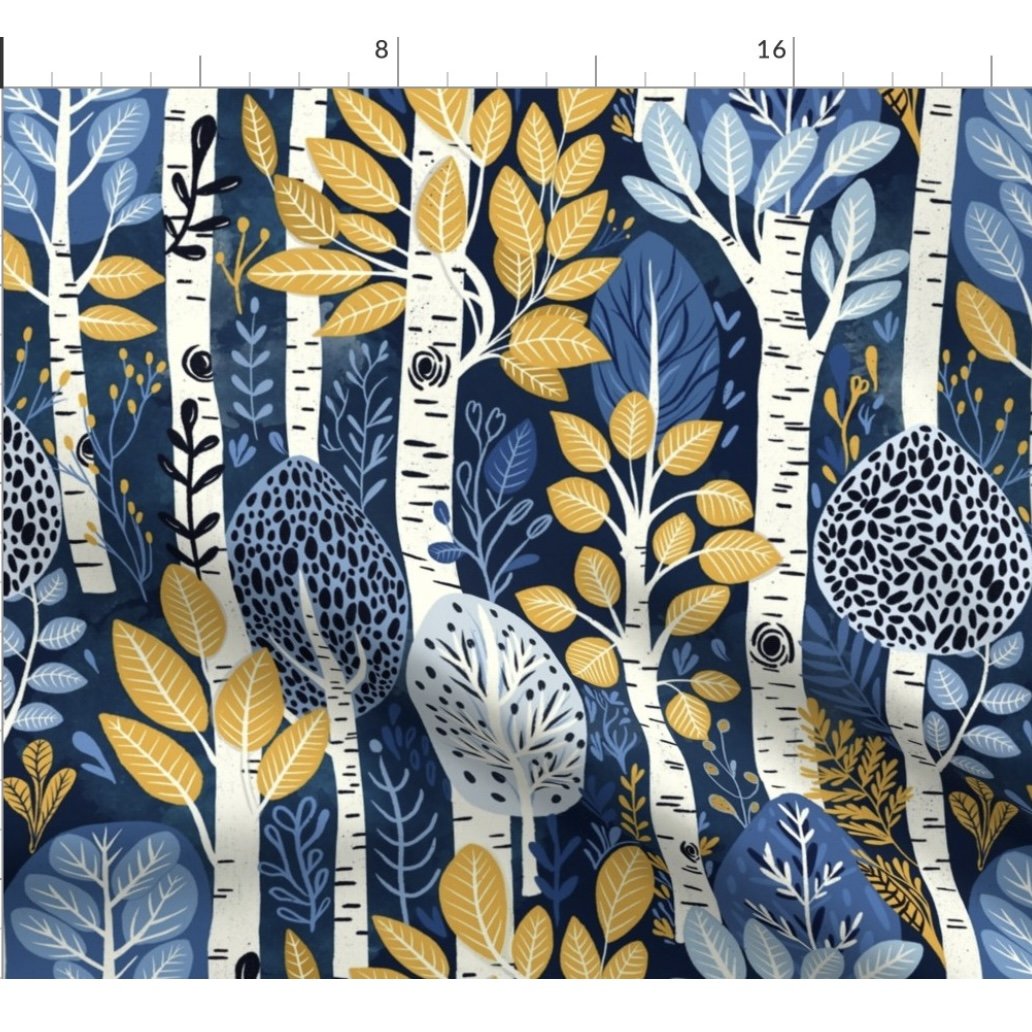
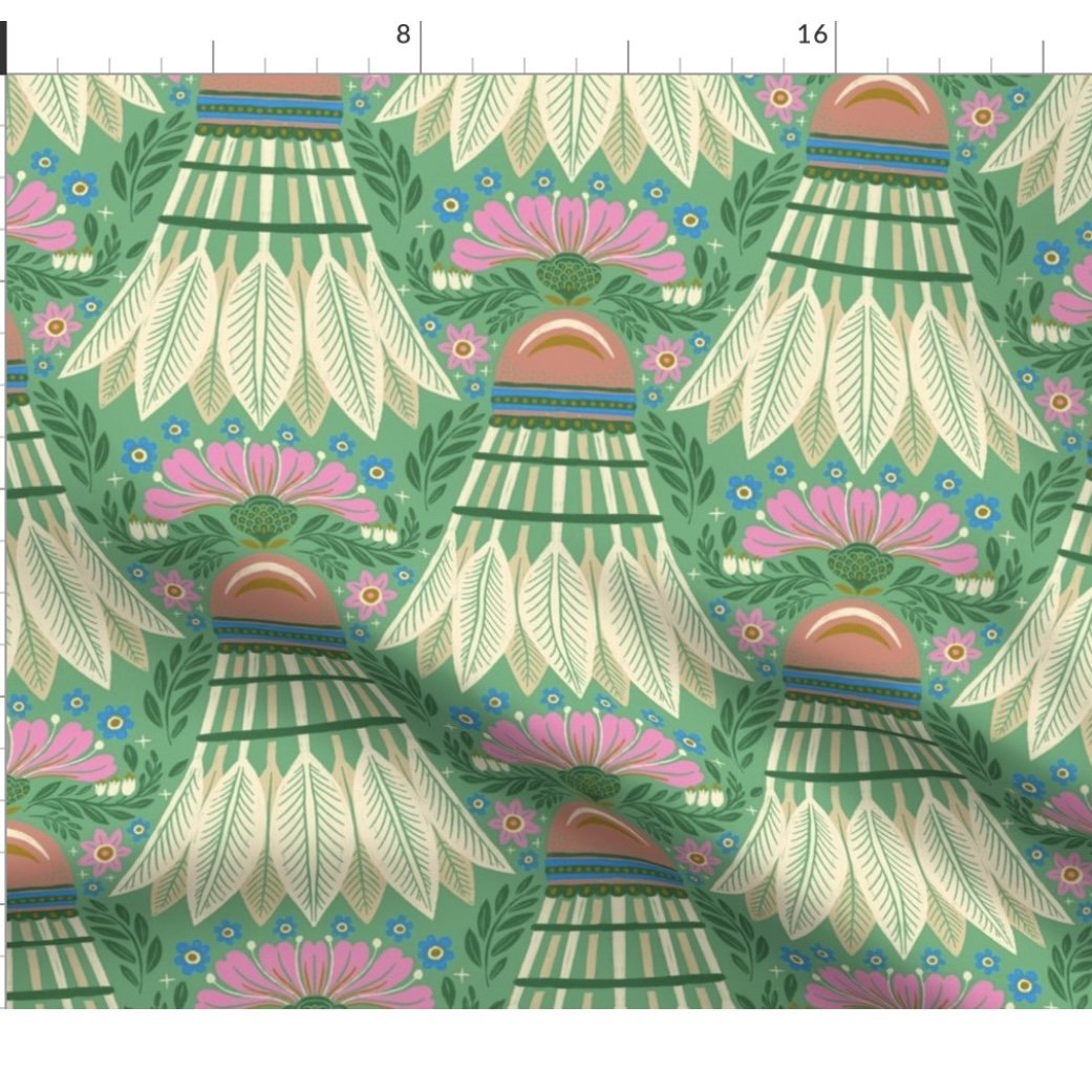
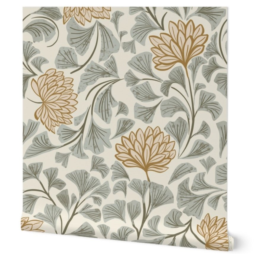
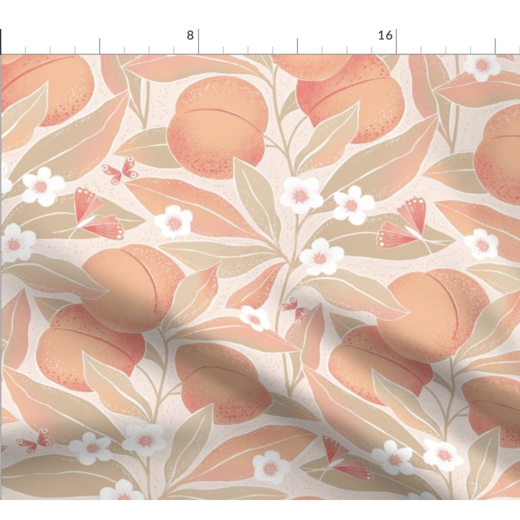
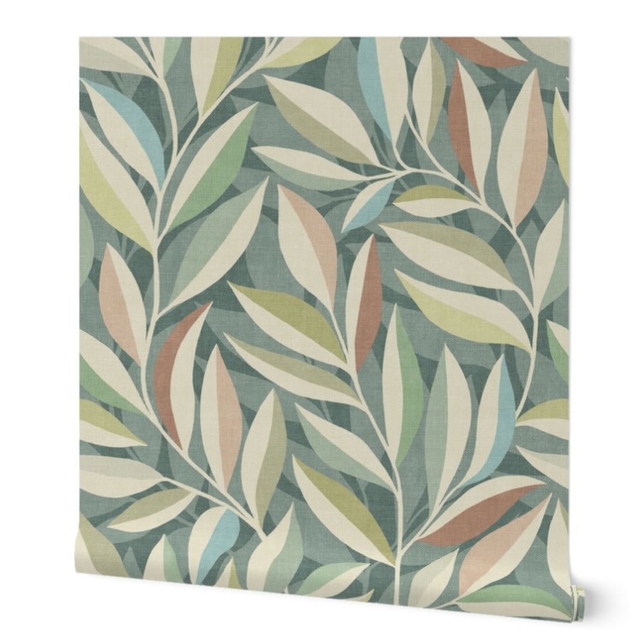
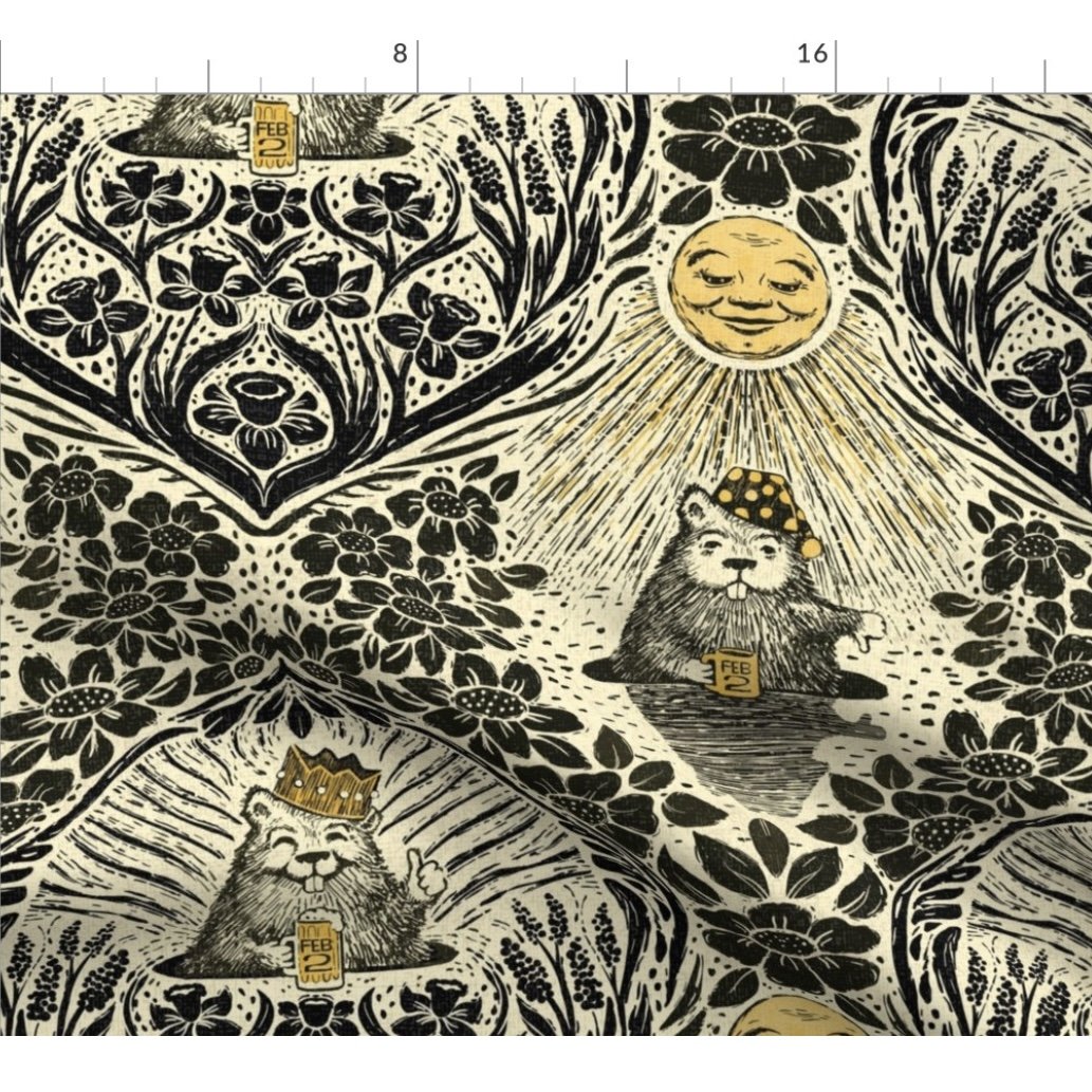
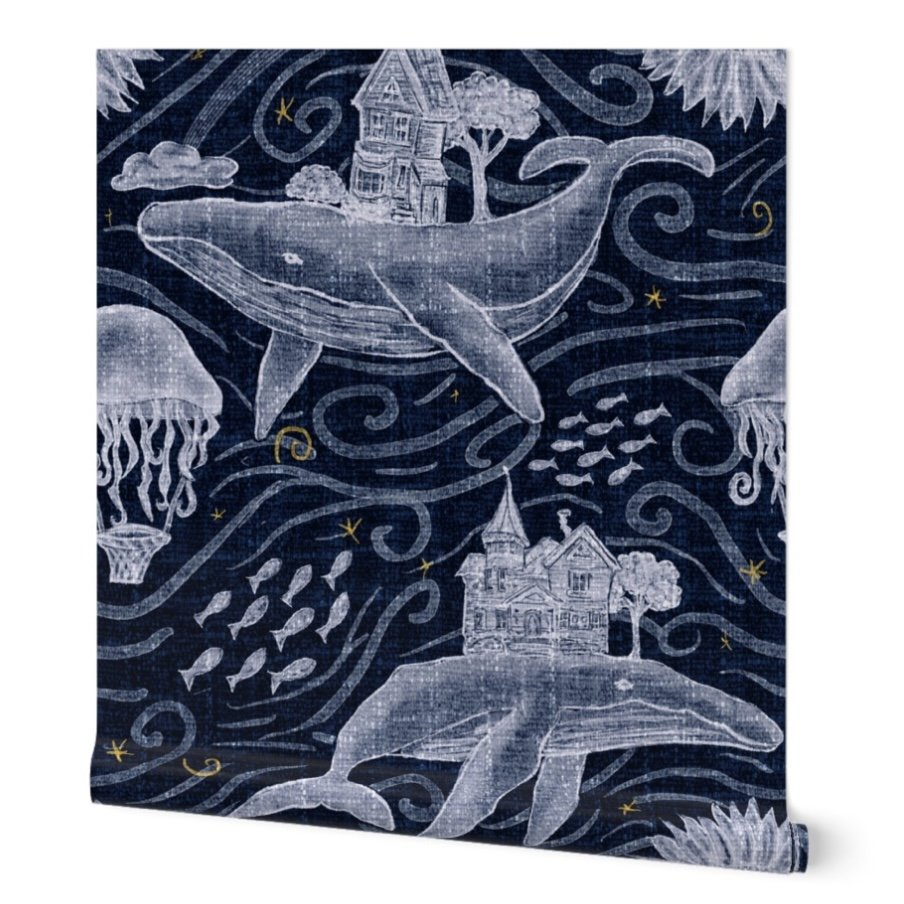
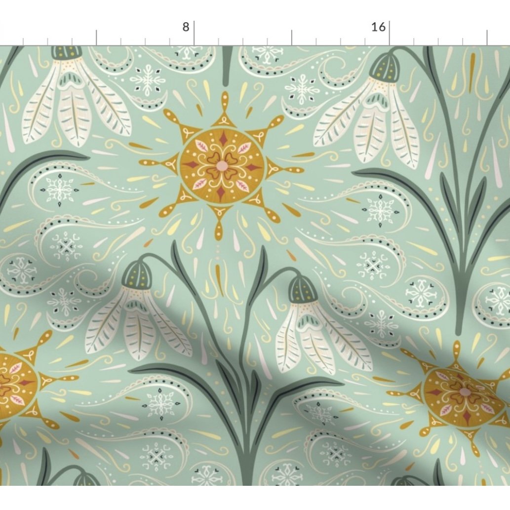
They are all lovely designs. (If you’d like to visit the design on the artist’s Spoonflower shop, just click on the picture.) These artists are all so talented.
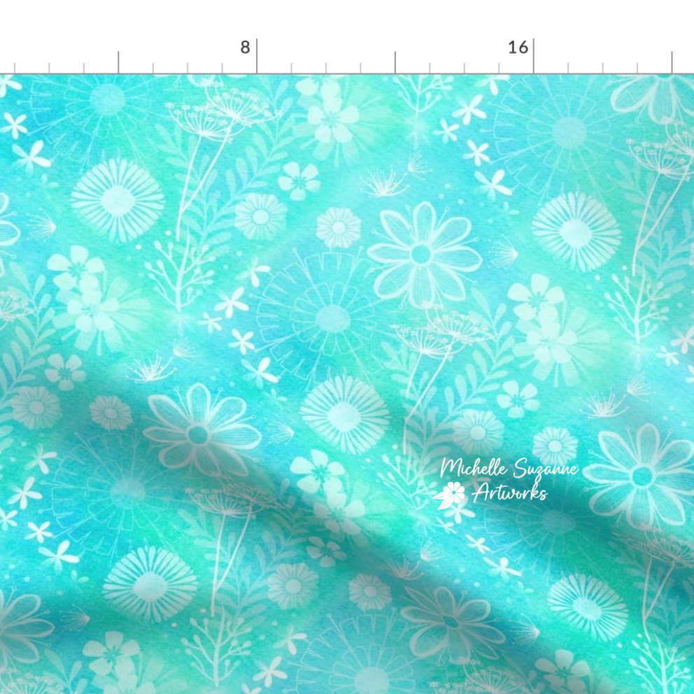
Despite the subject matter and styles being different from one another, there is one thing that stands out to me: the color palettes. Each design has a limited color palette, and the palettes are all somewhat muted. (To be fair, a couple of the challenges required muted colors.) Obviously, these color schemes are what appeals to most people, and are likely to be the designs with the greatest propensity to be purchased - especially in the categories of home decor and wallpaper. I will readily admit that not everyone shares my taste for purple and turquoise walls.
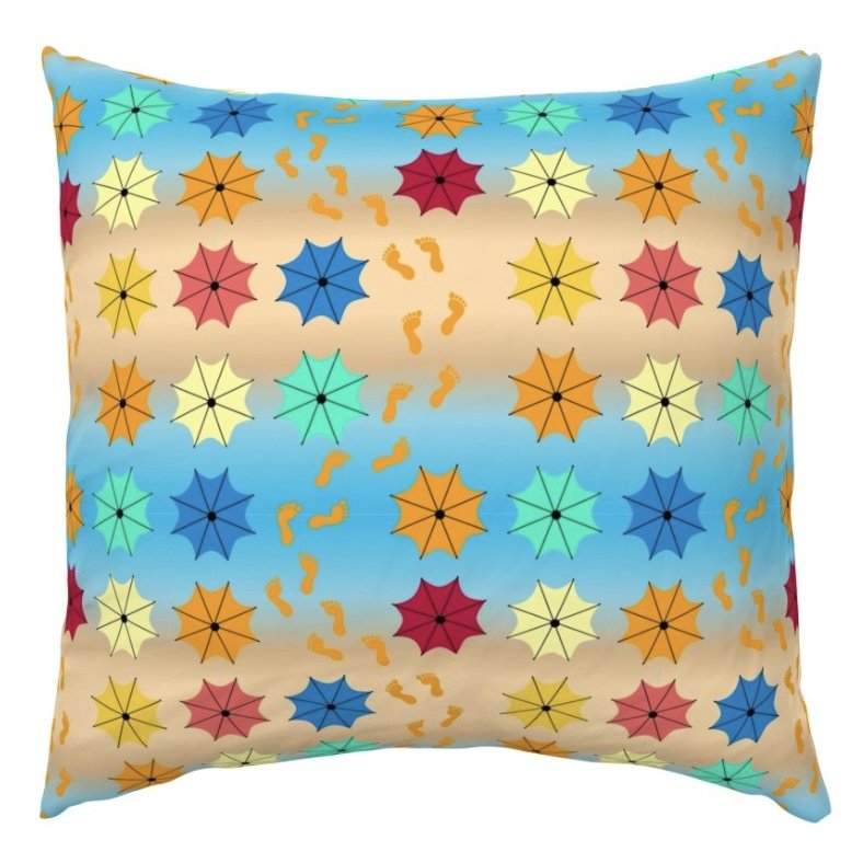
Even though, I recognize that everyone has their own preferences, I will admit that I was a bit a hurt when I offered up my design for the latest Spoonflower design challenge, “A Trip to the Beach,” on the Spoonflower Fans Facebook group (a group for both designers and buyers), and I received almost no acknowledgment (in the form of likes), and only one positive comment. This has been the trend with most of the designs I have posted there. It is especially disappointing, given that I always try to appreciate the creativity, skill, and work it took to create design, even if it’s not my preferred style. I leave a lot of encouraging comments and hearts.
Then I was miffed at myself for my emotional hurt since I know full well that my taste appeals to far less than the majority. That’s okay! And this group is actually for buying and selling; not support.
After further analysis I realized that people, even an aloof introvert like myself, have a desire for connection. And I wasn’t getting it from this group. In order to achieve that connection, I was going to have to change my style to make it more mainstream. Or I could just leave the group that wasn’t serving me well. And that’s what I did - with no ill feelings. I wish these aspiring commercial artists all the best. Even better, this group experience ultimately allowed me to hone in on my niche and purpose.
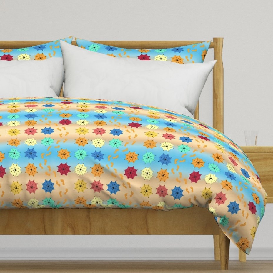
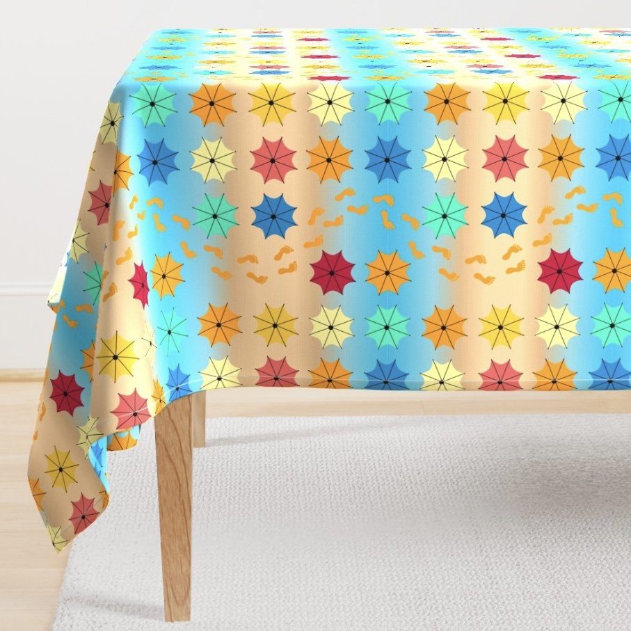
I create designs with vivid palettes in order to please myself, and the minority of people like myself who hunger for color. It’s a passion, not a money maker.
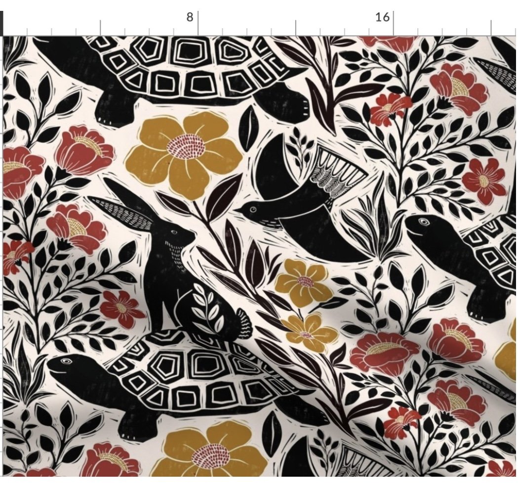
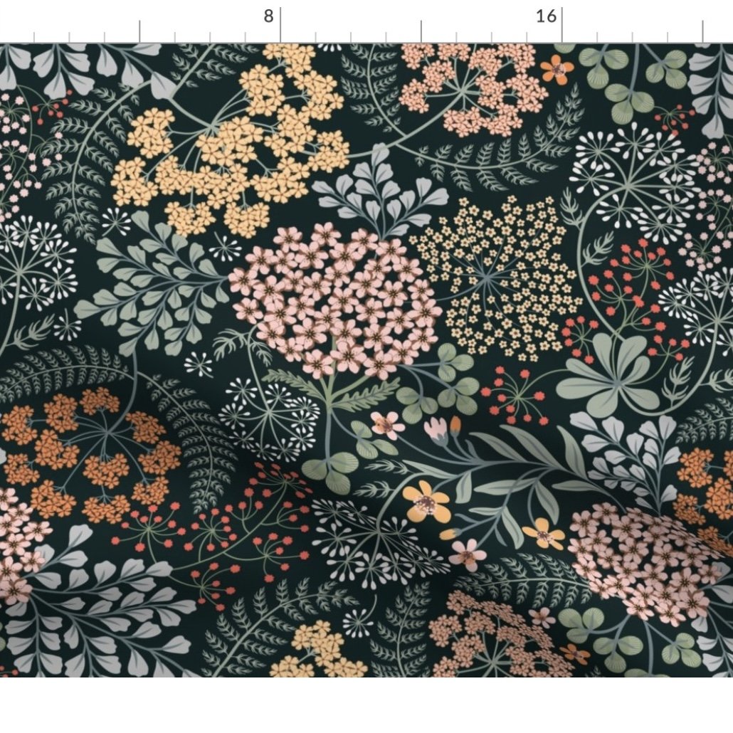
With that in mind, here are my designs that have been purchased. All of these purchases have been in fabrics, not home decor, probably from quilters and crafters like myself.
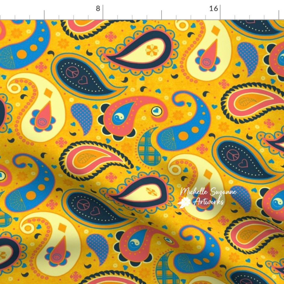
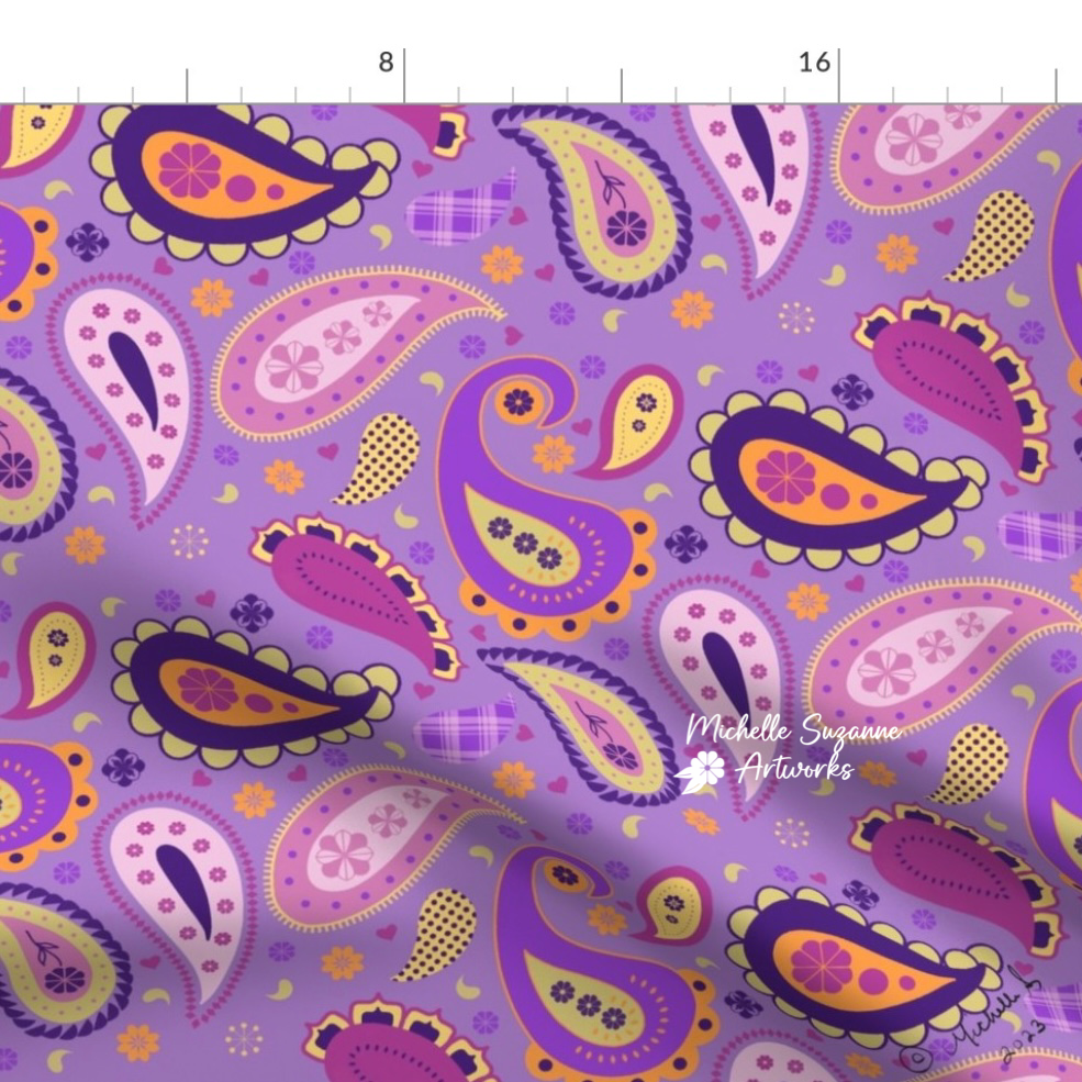
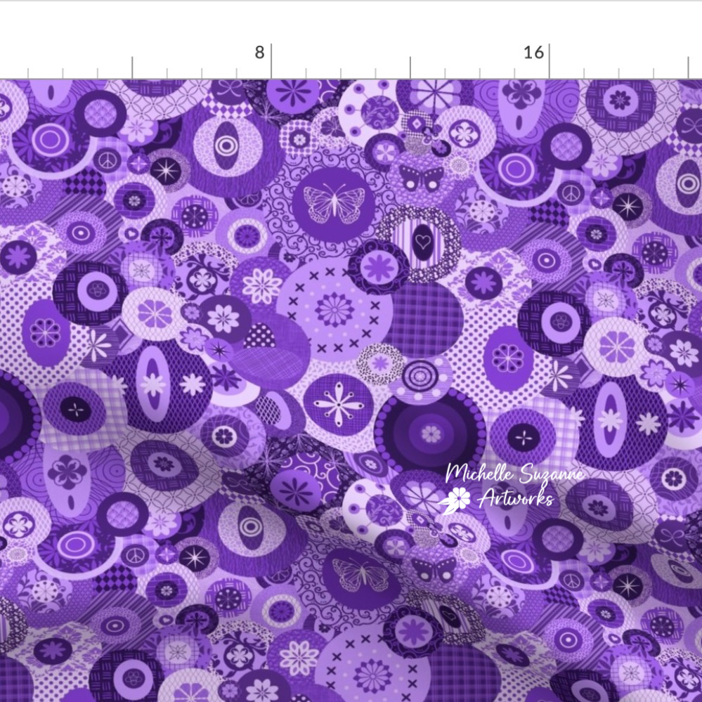
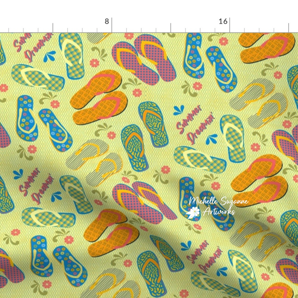
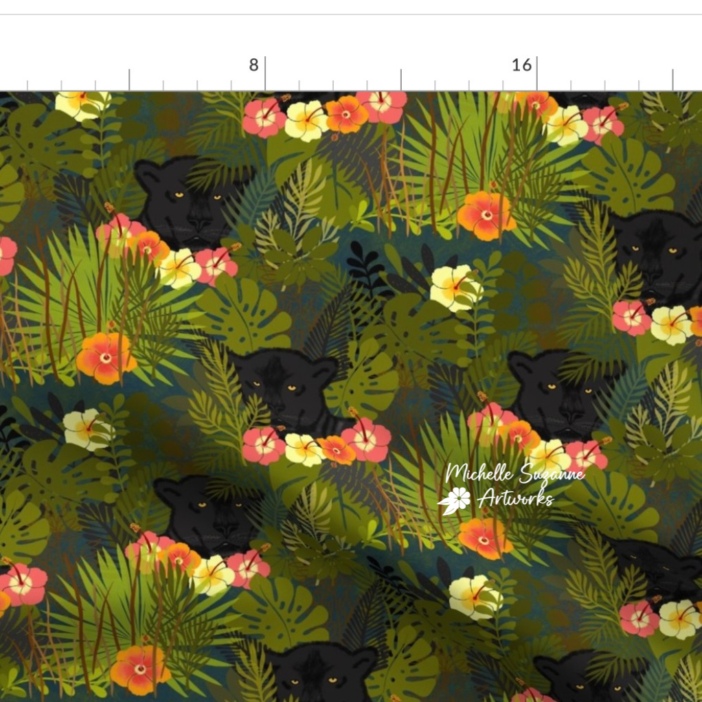
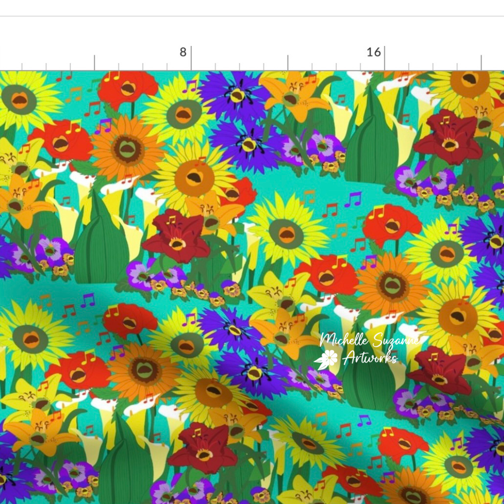
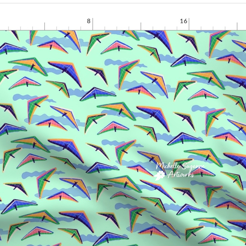
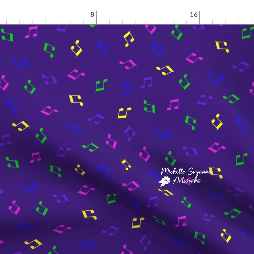
Not a dull one in the bunch!